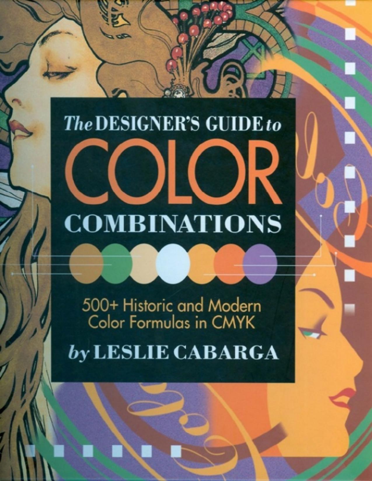
The Designer's Guide to Color Combinations (prop) by Leslie Cabarga

Author:Leslie Cabarga
Language: eng
Format: mobi, epub, pdf
Publisher: Adams Media
Published: 2019-11-13T16:00:00+00:00
TILED BATHROOM, 1950 I never would have guessed that this tile design represented the “Neo-class.mapic Trend” if it hadn't been labeled as such in the catalog advertisement from which this image came. Here we have walls of peach and a band of forest green. The floor colors include honeysuckle and lobelia. Anyone, in my opinion, would be lucky to have such a boldly hued environment cemented into her home.
1960
to
1969
COLOR
When we speak of design from the 1960s, we are really speaking of two distinctly individual trends. The first trend, from 1960 to 1965, was comprised of the unwinding inertia of the 1950s aesthetic (itself an atomic revamp of the 1930s). Actually, early 1960s color contained the morbid dregs of a cold-war, crew-cut sensibility that considered any color stronger than pink, tan, baby blue or gray as likely to be part of a communist plot. ♦ By 1964, a new energy, instilled by musical groups like The Beatles, began to inspire a liveliness in type and color that foreshadowed things to come. The first half of the 1960s was, nonetheless, a pale and dismal period for color. The second half of the 1960s was influenced by the fine-arts genres of Pop and Op Art, along with the rock concert posters of the psychedelic movement. The use of formerly taboo color combinations of full-strength complements like red and blue or the eerie and nauseating orange and pink came as close to an LSD trip as one might imagine without the use of drugs. ♦ At the same time, the “Swiss” school of clean, grid-like design made an indelible mark. It emphasized heavy borders and a blacker “color” of sans serif types while placing white space upon a pedestal. ♦ Somehow, all of these influences, including major revivals of Aubrey Beardsley and other Art Nouveau designers, the trendsetting work of Push Pin Studios, the growth of interest in Eastern mysticism, and the vivid rainbows of Peter Max, came together in a tradition-shattering period from which the world has happily not yet recovered. ♦ As I like to say, Flower Power never died, it's just been repotted!
Download
The Designer's Guide to Color Combinations (prop) by Leslie Cabarga.epub
The Designer's Guide to Color Combinations (prop) by Leslie Cabarga.pdf
This site does not store any files on its server. We only index and link to content provided by other sites. Please contact the content providers to delete copyright contents if any and email us, we'll remove relevant links or contents immediately.
Wonder by R.J. Palacio(8580)
Mastering Adobe Animate 2023 - Third Edition by Joseph Labrecque(3844)
Unlabel: Selling You Without Selling Out by Marc Ecko(3663)
Ogilvy on Advertising by David Ogilvy(3622)
Hidden Persuasion: 33 psychological influence techniques in advertising by Marc Andrews & Matthijs van Leeuwen & Rick van Baaren(3565)
Drawing Cutting Edge Anatomy by Christopher Hart(3529)
The Pixar Touch by David A. Price(3439)
POP by Steven Heller(3362)
The Code Book by Simon Singh(3189)
The Art of War Visualized by Jessica Hagy(3008)
Slugfest by Reed Tucker(3004)
The Curated Closet by Anuschka Rees(2975)
Rapid Viz: A New Method for the Rapid Visualization of Ideas by Kurt Hanks & Larry Belliston(2907)
Stacked Decks by The Rotenberg Collection(2883)
365 Days of Wonder by R.J. Palacio(2839)
The Wardrobe Wakeup by Lois Joy Johnson(2785)
Keep Going by Austin Kleon(2763)
Tattoo Art by Doralba Picerno(2668)
Tell Me More by Kelly Corrigan(2653)
